For our first class trip on Friday, we visited the National Gallery to see British art from 1750 -1850. Our analyses covered many artists, including Reynolds, Gainsborough, Van Dyck, Turner, Claude and Constable. Being that it was my very first time analyzing the composition of paintings, the task seemed difficult at first but got easier with each painting we got through. The first painting we looked at, ‘Lady Cockburn and her Three Eldest Sons’ by Joshua Reynolds, is shown below.

In this portrait, Lady Cockburn is painted as a poised, calm and loving mother. The rich red of the curtains and deep orange of Lady Cockburn’s clothes emphasize her and her children, painted with lighter shades of pink and beige. Because the red and orange surrounding Lady Cockburn and her children balance out, another deep color was needed to balance out the lightness of the column to the right of the painting. This is the purpose of the parrot, who adds the red to complete the balance around the subject. Additionally, the parrot is located in the golden section of the painting, as Lady Cockburn and her children take up most of the space in the rest of the painting. Lady Cockburn and her children form a triangular shape themselves, which is echoed in the background with the opening of the curtain where we see a landscape scene. The subjects are in the foreground of the portrait, conveying to viewers that they are the main focus of the painting. Reynolds’s use of dark colors to create curves and folds repeats throughout the painting from Lady Cockburn’s clothes all the way up to the curtains. For example, the curves in Lady Cockburn’s dress match the curves of her child laying on her lap, the arm of the child to the left, and the drape in the curtain above. The curves go from bottom left to right, the same way that the diagonal lines in the painting go. The painting can be split into there sections from two diagonal lines, all starting from the left and going upwards as the lines continue to the right. This splits up the picture to go from a dark section at the top left (with the curtains), to a light section in the middle (with Lady Cockburn and her sons), back to a dark section in the bottom right (with Lady Cockburn’s clothing).
After analyzing the composition of Lady Cockburn, we contrasted it to Van Dyck’s ‘Charity,’ featured below.
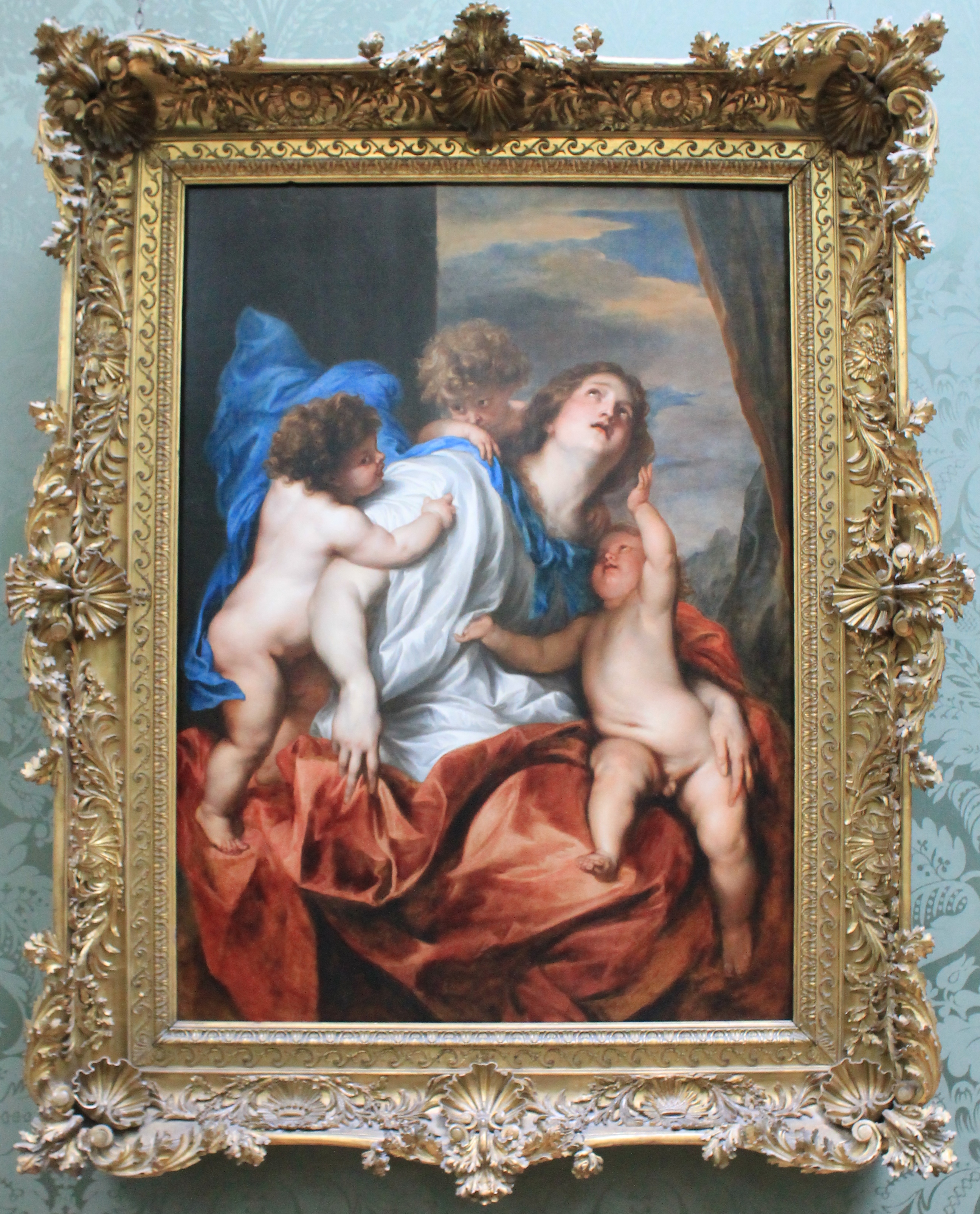

Van Dyck painted ‘Charity’ before Reynolds had painted ‘Lady Cockburn and her Three Eldest Sons.’ ‘Charity’ was painted as biblical reference to the three Christian virtues and represents the quintessential loving mother. Because Reynolds’s painting was a portrait of Lady Cockburn, it alluded to ‘Charity,’ portraying Lady Cockburn in the best light as a mother, thus flattering Reynolds’s client and showing Lady Cockburn her importance. Differing from ‘Lady Cockburn,’ ‘Charity’ has more vertical lines through the painting rather than curves. We can see the pattern of vertical lines through (from left to right of the painting) the child on the left’s body, the curtain in the background, Charity’s gaze up to God, and the child on the right’s body, from his left to his arm as he reaches up towards his mother. The blue cape around Charity’s body is complementary of the orange/red blanket at the bottom of the painting, and the blueness of the cape also brings out the blues of the sky in the background.
As we finished up contrasting ‘Lady Cockburn’ and ‘Charity,’ we returned to Reynolds and analyzed the composition of this painting, ‘Lord Heathfield of Gibraltar.’ The painting is pictured below, although the quality is not the best because of its high placement on the wall!

Similar to ‘Lady Cockburn,’ Reynolds uses dark shades of brown and orange around the picture to bring out his main subject, Lord Heathfield, in the middle. The brightness of Lord Heathfield’s red coat stands out against the darkness of the canons going off in the background. The story behind the painting is that Lord Heathfield, Governor of Gibraltar, is holding the key to the British fortress during the Spanish attack. When looking at the painting, the eyes are immediately drawn to the key that Lord Heathfield is holding. In photography, there is a term called the rule of thirds. It states that if the picture were broken into thirds, both horizontally and vertically, the eyes are drawn to the intersecting points of the horizontal and vertical lines dividing the picture. We can see that the key is at the spot where a vertical and horizontal line would intersect.
After analyzing Reynolds’s portraits of Lady Cockburn and Lord Heathfield, we moved onto his rival, Thomas Gainsborough. We looked at two of Gainsborough’s portraits; ‘Mr and Mrs William Hallett’ and ‘Dr Ralph Schomberg.’ These portraits, very different from Reynolds’s, are pictured below.

The couple of ‘Mr and Mrs William Hallett’ are portrayed as a very well to do, fashionable couple. We can see that to left of Mrs Hallett, where the dog is located gazing up at her, there is a golden section. In that golden section of the painting, the colors are lighter and Gainsborough’s brushstrokes are lighter, as well. These details are most noticeable in the dog’s fur, the left background of the trees and Mrs Hallett’s dress. Mrs Hallett’s dress itself is very detailed and contains many different colors which help blend it into the subjects and landscape surrounding her. For example, the front of the dress contains strokes of orange seen in the foreground, while around her waist and arm Gainsborough added blue to bring out the blue of the small trees and color of the sky in the background. As for Mr Hallett, his clothes give an overall darker tone as they are black. However, Gainsborough continues to work colors of the landscape into the clothing. We can see that, under Mr Hallett’s coat, there are hints of green and orange that are also surrounding him in the landscape. As for the lines of the painting, it is mainly vertical. Not only are Mr and Mrs Hallett vertical, but the portrait itself is. To create movement, Gainsborough has added small curves and diagonal lines throughout the portrait. The tilt of Mrs Hallet’s hat, the dog gazing up diagonally towards his owners and the curve of the trees in the background all relieve the strong vertical lines of the painting.

In this portrait, ‘Dr. Ralph Schomberg,’ we see many of the same techniques that Gainsborough used in his portrait ‘Mr and Mrs Hallett.’ Dr. Schomberg himself is painted with very clean cut lines, while the landscape around him is painted with light and loose brushstrokes. By doing so, not only is there movement within the portrait, but there is a shallow depth of field between the audience and the subject. Almost as if this were a photographed portrait, Dr. Schomberg is in focus, while the background seems to be blurred. His head specifically seems to be the most clean cut. The clouds behind him are very dull and there is not much texture or detail to them; it just seems as if it is a sheet of gray. This emphasizes the clean cut lines and details in Dr. Schomberg’s face and hair. As for colors, we again see that the landscape in the background is lighter and as we come to the foreground, the landscape is warmer. Dr. Schomberg’s red coat is complemented by the greens of the foliage that surround him. There are, again, strong vertical lines in the painting, as it is set vertically and Dr. Schomberg and his cane run directly up and down. However, they are relieved by the diagonal lines caused by the landscape and sky in the background. The flow of Dr. Schomberg’s coat curves in the same direction as the tree in the upper right hand corner, creating more movement in the portrait.
Overall, Gainsborough’s portraits seem to be much more honest than the portraits of Reynolds. ‘Lady Cockburn’ and ‘Lord Heathfield’ were both portraits where Reynolds depicted them not as themselves, but in a different light to flatter his clients. As for Gainsborough, he portrayed his clients in more natural, believable settings that seemed to capture his clients as they truly were.
We touched upon a few of Gainsborough’s landscape paintings before moving onto our third artist, J.M.W. Turner. Turner, best known for his paintings of light, had many works we could admire at the National Gallery. We focused our analysis on four of his works; ‘Ulysses deriding Polyphemus – Homer’s Odyssey,’ ‘The Fighting Temeraire,’ ‘Sun Rising through Vapour’ and ‘Dido Building Carthage,.’ All four paintings are pictured below, in order.

In both ‘Ulysses deriding Polyphemus – Homer’s Odyssey’ (above) and ‘The Fighting Temeraire’ (below), the audience is immediately drawn to the sun in the horizon. Both paintings have extreme detail when it comes to the sun. Not only does Turner add a handful of shades and colors to the light radiating off the sun, but he adds texture, too. If one looks up close to the sun in the painting below, for example, they will see the different textures of the light as it grows away from the center of the sun. Additionally, both suns rest on a body of water, where the blue sits vibrantly under the light. Both paintings include a strong contrast with the boats located in the left of the painting. The dark colors stand out against the recessive light shades of blues, yellows and whites. While the horizon creates strong horizontal lines between the sky and water in both pictures, the rays of the sun create diagonal lines which are mirrored in the boats to relieve the strength that the horizontal lines would create otherwise.


In these two paintings by Turner, ‘Sun Rising through Vapor’ (above) and ‘Dido Building Carthage’ (below), we see again Turner’s love for light and the detail he puts into how the light radiates off to the surrounding scene. His use of curves in the shoreline and sails of the above painting offset the horizontal line of the horizon and vertical lines of the ships’s masts. While the suns in these two paintings do not have as much textural detail as the previous two paintings, the vibrant yellow that Turner paints these suns with stand out compared to the rest of the colors and tones in each landscape. In the picture below, we see small, but many, vertical lines, especially in the pillars of all the buildings. However, many things bring movement to the picture, including the curves of the trees, the water, and the mountains in the background.

Upon looking at Turner’s paintings, one can immediately see his love of sun and light. In all of Turner’s paintings, the sun is the first place the eye is drawn to and the main focus of the painting. It seems that, no matter what else is going on in the painting, no matter how chaotic other elements may be, the sun and light source will always be Turner’s ultimate focus.
The last artist we looked at in the National Gallery was John Constable. Constable was famous for his landscapes, most of which are of the countryside of Suffolk, where he was raised. Two of his paintings, ‘Stratford Mill’ and ‘Salisbury Cathedral and Leadenhall from the River Avon’ are featured below.


In both of Constables’s paintings, we see hints of the 19th century French movement of Impressionism. With almost all objects and subjects Constable painted, there are smaller brushstrokes and lines giving more detail and movement throughout the paintings. In Constable’s ‘Stratford Mill,’ we can see that there is much more detail, especially with coloring, in the clouds to make them seem full and fluffy than there are in ‘Sainsbury Castle.’ It almost seems as if the clouds are blobs and smears in ‘Sainsbury Castle’ rather than a realistic representation. One thing quite fascinating about Constable’s paintings, though, is the way he uses color after color to get an extremely detailed and realistic painting of the reflection in the water. In both landscapes, it almost looks as if the water is a photograph, rather than a painting. In both paintings, there is a strong contrast between the sky in the background and the land in the foreground. The bold, dark colors of the landscape truly stand out when the skies are a light blue and gray. Between the details of color and brushstrokes, both of Constable’s landscapes have much movement and, unlike some of the other paintings we’ve analyzed, do not have any strong repeating vertical or horizontal lines. Because of his obvious Impressionist style, it is understandable why his paintings were more accepted in Paris rather than Britain.
As a Business major, I am unfamiliar with the art world and lack the knowledge that any artist or art history major would have at this point in college. However, I approached this course with an open mind and interest to learn about a completely different field of study. After all, being abroad in London (and Europe, for that matter) makes this the perfect time to learn about art in such a culturally rich setting. Our first class visit to the National Gallery proved to be nothing short of interesting and eye opening, and I cannot wait for our class visit to the Tate Britain next week!

Thank you for all of this information. I think you will enjoy visiting the various galleries that are at your disposal. Also, thank you for sharing what you are learning.
LikeLike