Abstract Expressionism, Minimalism and Sigmar Polke

Our third and final visit to the Tate Modern museum was to see the works of Mark Rothko, Sigmar Polke, and minimalist art during the 20th century. The first room we went to see consisted of paintings by abstract expressionist Mark Rothko. While there were only a handful of paintings in the room, a few are featured below.

Black on Maroon 1958 by Mark Rothko 1903-1970

(source: http://www.tate.org.uk/art/artworks/rothko-black-on-maroon-t01170)

Black on Maroon 1959 by Mark Rothko 1903-1970

(source: http://www.tate.org.uk/art/artworks/rothko-black-on-maroon-t01163)

Based in New York City, abstract expressionists, as the name suggests, aimed to make art that was not only abstract, but expressive and emotional in its effect, too. Abstract expressionists were inspired by surrealist artists’ idea that art should come from the unconscious mind, as well as being inspired by the automatism of Joan Miró. The whole of abstract expressionism can be broken down into two types: action painters and color-field painters.

Action painters, led by artists Jackson Pollock and Williem De Kooning, worked in a spontaneous and improvisatory manner. These artists often used larger brushes to successfully make sweeping, gestural streaks on the canvas. Action painters directly placed their inner impulses on the canvas. The best example of this is Pollock, who would place his canvases on the ground, moving around them and pouring gulps of paint directly from the can or trailing it from a paintbrush or a stick.

The second group of painters, color-field painters, were led by artists such as Mark Rothko, Barnett Newman and Clyfford Still. Different from action painters, color-field artists painted simple compositions with large areas of a single color intended to produce a contemplative or meditational response in the view. Color-field painters were very intrigued by religion and myth, as well as the sublime. The sublime had been related to formlessness, immensity, intense light or darkness, terror, solitude, and silence in nature for aesthetic theorists of the eighteenth and nineteenth century. The sublime also related to the solace of transcendence, which was the art where one could lose themselves. These ideas continued to be shown through 20th century landscape painters, specifically expressionist artists concerned with using color to provoke an intense experience.

Rothko, one of the most popular abstract expressionists there is, felt a very close tie with J.M.W. Turner, whose paintings we saw in our first visit to the National Gallery back in early September. Turner, famous for his landscapes, was on the verge of “abstract” with his later works. One of Turner’s paintings, Yacht Approaching the Coast, is featured right before walking into the room of Rothko’s Seagram murals and pictured below with one of Rothko’s Seagram murals.

Yacht Approaching the Coast c.1840-5 by Joseph Mallord William Turner 1775-1851

(source: http://www.tate.org.uk/whats-on/tate-modern/display/abstraction-and-sublime)

Black on Maroon 1958 by Mark Rothko 1903-1970

(source: http://www.tate.org.uk/art/artworks/rothko-black-on-maroon-t01031)

We can see the “abstractness” of Turner’s painting, especially when considering Rothko’s paintings and the feelings these abstract works produce. Rothko’s Seagram murals encourage not only prolonged looking, but also a constant change in placement in relation to the painting. Standing close to the big murals, one can feel small and a sense of solitude, whereas standing further away from the painting, one can appreciate the composition more, focusing on the relaxing feeling radiating from Rothko’s color choices and the “mistiness” to his brushstrokes. Simply sitting and staring at Rothko’s Seagram murals was essential into trying to understand the work.

The next area of art we explore at the Tate was Minimalism. In the 1960’s, artists associated with minimalism believed that a work of art should be totally independent of the world and its surroundings. Advocates of complete abstraction, minimalists did not imitate, symbolize or embody anything within their work. They believed that art should be defined by its evident physical characteristics: materials, form and scaled, and structural principles. Not only were physical characteristics important to minimalist work, but the viewer’s real-time experience, their physical presence in the space occupied by the work, was central to the work’s meaning, too. Of course, each artist had their own style and approach to their artworks. However, much of the art has an emphasis on geometry, mathematics, and essential qualities like weight and surface. Minimalists intentionally distanced themselves from an earlier generate of post-war painters and sculptors whose highly expressive approach emphasized the presence of the artist in the art, rather than encouraging the view to have their own reaction. Aspiring for autonomous art, minimalism took roots in early twentieth century experiments in abstraction, particularly Russian constructivism. Minimalism was a turning point within the art world, re-orientating art from modernism to post-modernism.

One of the most interesting works of art within the room was a copper box, constructed by Donald Judd in 1972. The box is pictured below.

judd-untitled-1972

(source: http://imageobjecttext.com/tag/donald-judd/)

We can see the most important aspects of minimalism with Judd’s work. First and foremost, we are immediately drawn to the materials he used. The work is constructed as a whole from copper, enamel and aluminum. The idea is quite simple – it’s just a box. However, there is a line drawn on the floor around all four side of box. There is about a foot or two of space between the sides of the box and the line surrounding it. We are not allowed to cross the line, so the distance that is created between you and the box only gives you a restricted view. You cannot see the bottom of the box – only the outside and about half of the inside of whatever four of the sides you are looking at. The inside of the box is a radiating red that does not show any reflection of the bottom of the box. Between the materials that the box is made of and the restricted view of the inside, we as viewers are left to wonder about what is inside of the box, if it’s the same material at the bottom, if it goes down deeper, etc. These questions we are left with are exactly what minimalist artists strived to achieve. It is abstract in the sense that we are wondering about the box and pondering it based on what we personally can see, and the materials used do not represent anything that could help us out with those questions – the box is completely independent of the world around it.

Another work that I chose to present on within the room of minimalist art was a series of 4 paintings by Josef Albers called Study for Homage to the Square. Two of the four paintings are featured below.

Study for Homage to the Square: Departing in Yellow 1964 by Josef Albers 1888-1976

(source: http://www.tate.org.uk/art/artworks/albers-study-for-homage-to-the-square-departing-in-yellow-t00783)

Study for Homage to the Square 1964 by Josef Albers 1888-1976

(source: http://www.tate.org.uk/art/artworks/albers-study-for-homage-to-the-square-t02312)

These paintings stuck out to me upon walking into the room because they reminded me of themes within cubism, and because I am quite particular to paintings that seem mathematic. Just like cubism, the different squares within the paintings make you think about space and scale inside the painting. How many times does the small square fit in the big square? What is the difference in scale between all three squares? These questions, not only cubist questions, but minimalist questions, too, show the physical qualities of scale that minimalists were so concerned with. Although these paintings are simply paintings and not made of any special materials, the use of color is worth noting as it alters the experience of the viewer when looking at the canvas. From far away, the yellow painting, to me, looked like it only had three squares. However, when I got closer and looked longer, I realized there was a fourth box, just a lighter shade of yellow. Again, depending on where the viewer stands, what is seen is different and alters the experience and what the view can get out of the painting. Looking straight on at the painting, the boxes play with the viewer’s perspective and seem like they are vanishing or set up as a tunnel. Standing from the side, the boxes seem flat and as if they are floating on the bottom of the canvas. These different views from Albers’s paintings show themes of minimalism and abstract art extremely well.

The last part of our visit at the Tate Modern consisted of visiting the Sigmar Polke exhibition: Alibis. The exhibition as a whole was quite extraordinary as it was filled with Polke’s works from when he was very young up until when he died. Throughout the exhibition we could see the progression of his work, through different materials used, different techniques he experimented with, and common themes in his work that represented different art movements. It was a great way to end our last class visit to the Tate Modern!

Cubism, Suprematism and Abstraction

In our second visit to the Tate Modern, we looked at cubist, suprematist and abstract art works. We started on Level 4 with Cubism.

In 1909, artist George Braque and his paintings fell under criticism for being made of “little cubes.” However, it was this insult that would turn into the name for this new art that gave the world a new vision. Cubism referred more to the actual image and its fragmentation. It did not really convey the perceptual and conceptual aspects of a cubist artist’s practice. During this time period, there were turn-of-the-century advances being made, such as x-rays and radio waves. These creations and discoveries could penetrate the fixed surface of matter, making pictorial conventions seem inadequate for capturing modern life. Instead, cubist paintings attempted to represent the complex nature of experience while acknowledging the flat canvas.

Then, from 1909 until 1914, artists Georges Braque and Pablo Picasso produced a detailed visual analysis of reality. First, they unraveled the familiar world surrounding them by depicting still-lives and figures. Limited color and build-up of small brushstrokes were influence by Paul Cézanne, while African art encouraged simplifying forms as planes or facets. As traces of the visible were gradually eliminated and illusory elements in collage and assemblage were introduced in 1912, the reconstruction of reality became evident. While Braque and Picasso’s intense collaboration tended to be exclusive, the impact of cubism was widely spread among Parisian artists and modernists in other major cities who rethought it for their own purposes. Even though Braque and Picasso never completely let go of reference to the visual world, many artists thought of cubism as a crucial step towards abstract art. The revolution of cubism from 1910 to 1912 is frequently referred to as Analytic Cubism. During this time, Picasso and Braque became so similar that some of their paintings are identical. Both artists’ analytical cubist paintings show the braking down, or analysis, of form. There are simplified color schemes to a nearly monochromatic scale designated to not distract the viewer from the artist’s primary interest, the structure of form itself. This monochromatic color scheme was mainly made up of hues of tan, brown, grey, cream, green or blue. It was suited to the presentation of complex, multiple views of the object, which was then reduced to overlapping opaque and transparent planes. These planes seem to move beyond the surface of the canvas instead of receding into the deep background. The forms in the paintings are generally compact and dense in the center of analytical cubist work, growing larger as they diffuse toward the edges of the canvas.

Below is an image of the painting Bottle and Fishes (1910-12) by Georges Braque. This painting includes many of the techniques specific to Analytic Cubism.

Bottle and Fishes c.1910-2 by Georges Braque 1882-1963

(source: http://www.tate.org.uk/art/artworks/braque-bottle-and-fishes-t00445)

Upon looking at the painting, we can immediately see how it is fragmented into squares and rectangles in a grid-like structure. As mentioned before, Analytic Cubism was known for having its forms dense and compacted into the center and grown bigger as they spread towards the edge of the painting. We see that, in the center, the table of fishes is broken down into many defined shapes, however around the edges of the canvas, there are bigger planes and not as many squares. Additionally, Braque stuck to the monochromatic hues that are seen in Analytic Cubism. There are mostly blues, greys and browns, keeping the painting very dull, however also allowing us to focus on the stricter of the subject matter. As analytic cubists were primarily concerned with form, we can see how Braque distorted what is supposed to be fishes on the table. We can make out a fish head towards the front of the painting, on the side, and on the top of what looks like a pile of squares. Towards the bottom front of the canvas, we can also make out a drawer, which leads us to search for a table and a perspective. Since the name of the painting is Bottle and Fishes, we then search for the bottle, which is noticeable in the back left. Although the bottle is not as distorted as the fish are towards the center of the canvas, it is still broken up into shapes, which make us analyze the bottle, looking to see where it is in relation to the fish and the table, how tall it is, from what angel are we looking at it, etc. Between all of the fragmentations and the monochromatic hues, Braque encourages us, the audience, to focus on the form of the subject and the many perspectives from which it can be seen.

Apart from Analytic Cubism there is Synthetic Cubism. Synthetic Cubism was what Analytic Cubism became after 1912. Works of this part of cubism emphasize the combination, or synthesis, of forms in pictures. Color asserts itself strongly in these paintings. Shapes, while still fragmented and flat as before, are larger and more decorative. Smooth and rough surfaces are contrasted with each other, and, more often than not, foreign materials like newspapers or tobacco wrappers are pasted on the canvas in combination with painted areas. This technique, known as collage, further emphasizes the difference in texture and simultaneously poses the question of what is reality and what is illusion. As Synthetic Cubism came from Analytic Cubism, Braque and Picasso were credited with creating this new phase. However, it was artists like Léger, Delaunay, Gris, Duchamp, Gleizes and Metzinger that further developed Synthetic Cubism.

The one Synthetic Cubist work we focus on was by Juan Gris, entitled Bottle of Rum and Newspaper (1913-4). The picture of the painting is shown below.

Bottle of Rum and Newspaper 1913-4 by Juan Gris 1887-1927

(source: http://www.tate.org.uk/art/artworks/gris-bottle-of-rum-and-newspaper-t06808)

As we can see, this painting is very different than that of Braque and Analytic Cubism. Gris’s painting is another great example that demonstrates the ideas and techniques behind Synthetic Cubists at the time. We are drawn immediately to the bright colors and flat shapes that were not present in Analytic Cubism. Additionally, we notice the printing of a newspaper and the grain lines of what seems to be wood. Between the flat shapes and geometric lines, we look at the subject matter of the painting in a new way than we did with Analytic Cubism. From the title, we know that there is supposed to be a bottle of run and a newspaper. We see the newspaper from the printed letters that are legible, however it is distorted a bit between the different colors and ways it is presented. The blue printing of the paper has obvious letters, however it is different than the normal white and black of a newspaper. This could be Gris giving us a new perspective on how to look at it. Furthermore, the shape that the newspaper takes (triangular on the top and rectangular in the body) is repeated through the painting with solely color and no letters or printing. As for the bottle of rum, there is no apparent bottle shape in the picture. The only thing that comes close to it is the shape of a circle that is repeated throughout the painting. There is an outline of it in black, then it is repeated in green, then again in blue. These colors and directions of the circle can also show different perspectives of the bottle. Between the newspaper and the bottle of rum, Gris makes us wonder the direction to which we are looking at the table. It seems to be a table because of the grain lines of wood. Aside from the colors and perspectives, Synthetic Cubists were known for fusing unlikely materials together. The newspaper, wood grain and paint all work together to demonstrate Synthetic Cubists’ aim to question the difference between what is reality and what is illusion in the painting.

When we were done looking at Analytic and Synthetic Cubism, we moved onto Abstract art from 1920-1935, otherwise known as Abstract art between the Wars. Abstract art, in general, focuses on the art for what it is. In other words, it does not imitate, embody, or represent something recognizable from reality. It uses shapes, colors, forms and textures to achieve their effect. The subjects of abstract art are generally derived from a visible object, to which the artist then adds abstract elements to arrive at a more or less simplified or schematized form of the original object. The theoretical ideas behind abstract art are vast. Many believe that it is art that is for art’s sake, and it is purely about the creation of beautiful effects. It is also believed that abstract art is like music, and that its effects should be created by patterns, specifically of form, color and lines. According to Plato, the highest form of beauty lies in geometry, which is an important point to many who believe that abstract art represents the spiritual world rather than the material world. Altogether, abstract art is seen to carry a moral dimension as it can be seen to stand for virtues such as order, purity, simplicity and spirituality. However, the history behind abstract paintings and the context in which they were created are key in understanding and appreciating the works. There is a depth added to the interpretation of the paintings when the history, social, political and cultural contexts are known.

While we looked at many abstract pieces of art, the one I was drawn to the most was No. 98 2478 Red/135 Green (1936) by Georges Vantongerloo. The image of the painting is shown below.

No. 98 2478 Red/135 Green 1936 by Georges Vantongerloo 1886-1965

(source: http://www.tate.org.uk/art/artworks/vantongerloo-no-98-2478-red135-green-t01574)

Perhaps it is because I like order and organization that I like this painting very much. Because of that, out of all the abstract works we saw, this was the one that I could appreciate the most. As discussed before, important theories behind abstract art include geometry and pattern. In this painting, the lines, which break the canvas up into squares, create that sense of pattern and give an overall geometric feeling. After looking at the painting for a period of time, I started to wonder about the geometry and specifics of the shapes in the painting. Do the colored lines fit into the white spaces a certain amount of times? Do the white spaces fit into each other a certain amount of times? Is there a precise reasoning behind the length of the colored lines? After looking up the painting, the Tate provided an answer to my questions. The information to this painting on the Tate website states, “The basic unit (1) is the white rectangle and green stripe on the left of the bottom row. The second and third spaces along are each equivalent to two of these rectangles. Adding these numbers (1, 2, 2) cumulatively results in 1, 3 (1+2), 5 (3+2) for the green stripe section. The red row works on the same principle to give 2,4,7,8” (tate.org.uk). These numbers are also the reasoning behind the name of the painting. It was the type of response I had that abstract artists aimed for – they wanted their viewers to appreciate the art for what it is, rather than wonder what led the painter to paint this and if there is a deeper meaning behind the painting. Additionally, the clean-cut lines and choice of colors in the painting give it a simple composition with order – a clear distinction of abstract art form other arts.

The last part of our class visit was to see the Malevich exhibition currently going on at the Tate Modern. Kazimir Malevich, one of the most influential and radical painters of his time, lived and worked through one of the most turbulent periods in the twentieth century’s history. Being from Russia, Malevich witnessed the First World War and the October Revolution first-hand. Earlier in his painting career, his experiments led him towards the invention of suprematism, a bold visual language of abstract geometric shapes and stark colors. His exhibition at the Tate Modern seemed to show the progression of his work, specifically the effects that reality had on him and the way he produced work during his lifetime. It also seemed to show how Malevich viewed his work and influences, as shown in the pictures below. One of the rooms was curated the way that one of his rooms filled with his art works was set up.

Malevich’s Room:

malevich-mono

(source: http://www.tate.org.uk/context-comment/articles/cosmos-and-canvas)

Room at the Tate Modern’s Malevich Exhibition:

malevich16

source: http://www.tate.org.uk/context-comment/articles/five-ways-look-Malevich-Black-Square

Within the exhibition, many of Malevich’s most famous works are featured. The most famous being Black Square, pictured below:

malevich5

(source: http://www.tate.org.uk/context-comment/articles/five-ways-look-Malevich-Black-Square)

As stated before, suprematism, created by Malevich, was a bold visual language of abstract geometric shapes and stark colors. As abstract art was concerned with art for art’s sake, we can see the relationship between Malevich’s suprematism and abstract art here. In Black Square, absolutely nothing is depicted or represented. It is a geometric shape – a literal black square – painted with a black that stands out boldly against the white background. As a quintessential abstract piece, there is no correct way to look at the Black Square, either. However, most importantly, Malevich had also intended for Black Square to be the start of something new, rather than a representation of the old. He painted this in the midst of the First World War. Seeing all the hardships the Russians were going through and anticipating the worst, Malevich created Black Square with the intention that it would suggest the dawn of a new age – an age without the war-like atmosphere he was engulfed in. Overall, Malevich’s works were something radically new that influenced a new way of thinking within the art world. His exhibition showed the progression of his work and emphasized the fact that reality has one of the biggest effects on artists, even if they aren’t producing art that represents or imitates reality. This was another successful class visit to the Tate Modern – there was a lot to see and even more to learn!

Dada and Surrealism

Moving on from the National Gallery and the Tate Britain, our fourth class visit was to the Tate Modern to see works of Dada and Surrealism. This visit to the Tate Modern would mark the first of three consecutive visits as we move towards contemporary art.

Formed during the First World War in Zurich, Dada art negatively reacted to the horrors and idiocy of the war. Dada artists are known for producing art, poetry and performance that are satirical and nonsensical by nature. These artists felt that the war questioned all aspects of a society capable of starting and then prolonging it – its art included. Dada artists aimed to destroy traditional values in art and create new art to replace the old. As well as being anti-war, Dadaists were anti-bourgeois and had political sympathy with the radical left. Founder of dada art, Hugo Ball, started a satirical nightclub in Zurich in 1916 called the Cabaret Voltaire, and a magazine, which he named “Dada.” Dada became and international movement, which ultimately formed the basis of surrealism in Paris post-war. Popular Dada artists include Arp, Marcel Duchamp, Francis Picabia, Man Ray and Kurt Schwitters. Many of these artists have work featured at the Tate Modern.

One of the Dadaist artists we studied on our visit was Man Ray. He was an American painter, photographer and maker of surrealist objects. One of his surrealist objects, New York (1920), is pictured below.

New York 1920, editioned replica 1973 by Man Ray 1890-1976

(source: http://www.tate.org.uk/art/artworks/man-ray-new-york-t07882)

Man Ray’s New York was originally made out of olives in oil, however it was unfortunately destroyed. Man Ray then replicated it using steel balls, as we see now. Ray’s use of language in this object works in conjunction with the shape and materials of the object. The 1920’s were a time in New York where the city was expanding and modernizing. The tall shape of the object, along with the steel balls, can be seen as a skyscraper from New York between Man Ray’s choice of shape and material. Along with the written letters “New York,” it seems to be a representation of the city and what it was going through at the time, one way in which the object engages with free play of ideas and associations. Out of all the aspects of the object, I believe the steel balls are what influence my interpretation the most. The steel automatically makes me think of buildings, industries and advancement, especially in a city like New York.

After seeing some Dada works, we moved onto Surrealism. Launched in Paris in 1924, Surrealism was started by French poet André Breton with his publication of Manifesto of Surrealism. Breton was strongly influenced by the theories of the founder of psychoanalysis, Sigmund Freud. Freud identified a deeper layer of the human mind, one in which memories and our most basic instincts are stored. He named it the unconscious since we are not aware of it the majority of the time. Freud’s beliefs and publications were central to surrealism, such as his book The Interpretation of Dreams and his belief that dreams revealed the workings of the unconscious mind. Surrealism aimed to reveal the unconscious and reconcile it with a rational life. It also aimed at social and political revolution and, for a short time, was affiliated with the Communist party. Surrealism, in general, had an enormous influence on art, literature, cinema, and social attitudes and behavior. Although there was no specific, set style of surrealism, there are two broad types into which it can be broken up: automatic and oneiric.

AUTOMATIC SURREALIST ART: Automatism, the same as free association, was the method used by Freud to explore the unconscious mind of his patients. Automatic surrealist art consists of works by later Max Ernst and Joan Miro. As stated before, André Breton was strongly influenced by Freud. The earliest examples of automatism are the automatic writings of Breton and others, produced by simply writing down as rapidly as possible whatever springs to mind. Other techniques included the surrealist collage, the first form of visual automatism, which was invented by Max Ernst. Ernst would put together images clipped from magazines, product catalogues, book illustrations, advertisements, and other sources to create a strange new reality. Painting-wise, various forms of automatism were developed by artists such as Miro, Masson and Ernst. One of Max Ernst’s paintings, The Entire City (1934), is pictured below.

The Entire City 1934 by Max Ernst 1891-1976

(source: http://www.tate.org.uk/art/artworks/ernst-the-entire-city-n05289)

In 1925, Max Ernst created a new method of painting called “frottage.” In frottage, the artist creates a rubbing of a textured surface using pencil or other drawing materials. Ernst went further than using pencil and drawing materials, and used an even wider range of textured materials as he adapted the technique to oil paintings, calling it “grattage” (scraping). We can see that, in his painting above, grattage was used to create the “city” pictured. The distorted “city” represents the ideas of automatism that influenced many surrealist artists. There is a chance that artists were willing to take with techniques like frottage and grattage, not knowing how exactly it will turn out. Just like the automatic writings of Breton (where he would write down whatever sprung to his mind as rapidly as possible, no matter what it was), things produced were left up to chance and the artists really had no control.

ONEIRIC SURREALIST ART: Oneiric surrealism, also called dream-like surrealism, consists of work by artists like Salvador Dalí, early Max Ernst and René Magritte. These paintings are very different than the works of automatic surrealist art. Dalí, for example, has a style that is recognizable anywhere. His paintings are often confusing, busy, and even provocative at times. However, his style of paintings is the quintessential oneiric surrealist art. Below is one of his most known paintings, Autumnal Cannibalism (1936).

Autumnal Cannibalism 1936 by Salvador Dalí 1904-1989

(source: http://www.tate.org.uk/art/artworks/dali-autumnal-cannibalism-t01978)

Immediately upon looking at Dalí’s painting, it looks dreamlike from the shapes and flow of the objects painted. Confusing and difficult to piece together, the painting seems like memories from a dream that one tries to put together when they wake up to make sense of it all. We see two figures that take up the center of the painting. It looks to be to bodies with heads that seem to be eating each other. The figures also look to be embracing each other, however they also seem to be eating each other as shown by the utensils each one is holding as they jab into the other’s body. While this idea of two people eating each other is disturbing at first, there is an element of affection between the two because of their intense embrace. There is no clear cut ending to the figures, and it is unclear where their bodies lead to and the direction they go in. It almost seems that they are part of the table they are placed upon. Dalí also plays with perspective in this painting, as shown by the shape of the table in the forefront of the canvas and the smallness of the objects in the background. There are earth-like tones throughout the whole painting, giving it a darker feeling rather than an upbeat one if there were brighter colors included. There are also many, many random objects that appear in the painting. To name a few, there are the snails on the front of the table, the apple on one of the figure’s head, and the sock-like object underneath the apple. These random objects also emphasize the fact that this oneiric painting is dream-like, as there are many things that appear in our own dreams that we cannot understand or make sense of. This painting is typical Dalí and gives a very good sense of what many of his paintings are like.

The Impressionists and the Post-Impressionists

For our third week of class, we returned to the National Gallery to look at work from the Impressionism and Post-Impressionism movements. A handful of the paintings from these art movements are some of the most popular paintings of all time, including works from popular artists like Manet, Monet, Van Gogh and many others. The trip started off by looking at works of Impressionism. The 1860’s marked another time where artists were radically changing the art game. Edouard Manet’s exhibition left visitors shocked as he featured paintings of modern life. He was one of the first artists to do so. Capturing aspects of contemporary life lead to new painting techniques, such as rapid, sketch-like brushstrokes and bright colors. These techniques were continuously practiced by other artists who were inspired by Manet, such as Claude Monet and other young artists in Paris at the time. Within the beautiful city of Paris, these artists often painted along the river Seine. Working to incorporate fleeting effects of light and color in the water, flickering brushstrokes were popular among these artists to successfully paint what they were experiencing. As we saw with the Pre-Raphaelites, this radically new way of painting was not fully accepted by society at the time, so the artists banded together informally to advance their art and help organize an exhibition of their works in 1874. From this exhibition, the artists and their works were dismissed as merely “impressionist.” Because of the informality of the group, artists went off in their own directions and became less cohesive. However, Monet remained loyal to the Impressionists style, which is why many of his works are still popular today. His continuous exploration of light and color in different conditions and times of day show the range of what he was able to paint.

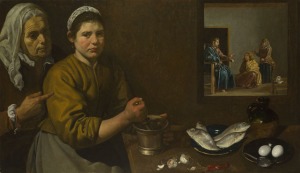
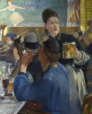
While there were many Impressionist and Post-Impressionist artists to see at the National Gallery, this blog post will cover just a handful of the most important and influential artists of Impressionism and Post-Impressionism. We will start out with Edouard Manet. Manet was known for his unconventional subject matter. He paintings were of modern life, and his concern for the artist’s freedom in handling paint made him an important precursor of Impressionism. His work was established on the opposition of light and shadow, a restricted palette where black was vital, and on painting directly from the model. Manet was highly influenced by Spanish painter Velázquez, whose style he adopted. We can see similarities between the works of Velázquez and Manet below in two of their paintings. The first is Corner of a Café-Concert (1878-80) by Manet, and the second is Christ in the House of Martha and Mary (1618) by Velázquez.

manet-corner-cafe-concert-NG3858-fm

(source: http://www.nationalgallery.org.uk/upload/img/manet-corner-cafe-concert-NG3858-fm.jpg)

There are many techniques in this painting that are specific to Manet and his Impressionistic style. First off, the subject matter of the painting is something completely different than what had been painted up until this time. Manet is depicting a scene of modern life, which was something not typically painted by artists. Additionally, the brushstrokes of Manet’s painting are different than what was typical of the time. His brushstrokes were rapid and sketch-like. We can see throughout the canvas the different and defined brushstrokes. This technique was one that would influence painters after Manet, such as Monet and other young artists in Paris at the time. Manet was known for his painting of light, shadow and limited color choice. Towards the top left of the canvas, Manet chooses lighter colors to show that the ballerina, and the stage she is on, are lit up by spotlights. As for the rest of the canvas, there is a darker tone with similar colors, such as blacks, greys and blues. There are some yellows, browns and whites, however they are in no way overpowering. There are no bright, bold colors in this painting by Manet, but we do see his love for the color black as it makes up many objects in the painting, such as the waitress’s blouse, the man’s hat, the bassist’s hair, etc. The back color is even used to show shadows throughout the painting – another technique specific to Manet as he was known to paint the difference between light and shadow.

velazquez-christ-house-martha-mary-NG1375-fm

(source: http://www.nationalgallery.org.uk/upload/img/velazquez-christ-house-martha-mary-NG1375-fm.jpg)

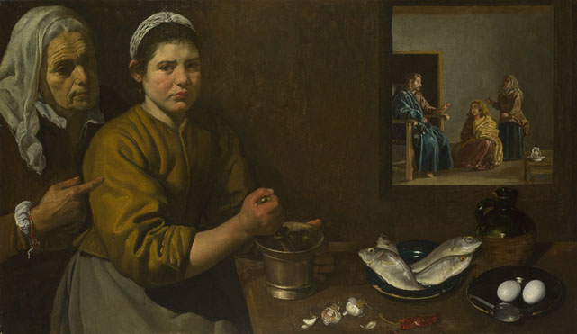
In this painting by Velázquez, we can see the similarities between his and Manet’s work. As for the subject matter, it does allude to Christ and a biblical scence. However, it is not a typical biblical scene as it is seems to be depicting a honest, contemporary view of the main woman in the painting working. As for colors, we can see that Velázquez also had a limited palette. There are mainly browns, reds and greys in this painting, with some touches of blue and white. Additionally, Velázquez plays with shadow and light between the foreground and the background in the top right of the canvas. The foreground seems to be in a darker room, whereas the background in the top right corner seems to be a bright room separated by a window. Velázquez’s creation of the small window plays with space and creates a deeper perspective within the painting. We could point out a similar point in Manet’s painting as he played with light and shadow to show the ballerina in the far background of the painting and gave us (the audience) the perspective that we were in the foreground with the waitress. Between all of these similarities, it is obvious that Manet was highly influence by Velázquez.

Just as Manet had a huge artistic influence, he was himself a huge artistic influence to many artists in Paris, especially Claude Monet. Manet influenced Monet’s figure compositions during the 1860’s. The Impressionist period cannot be discussed without mentioning Monet. His techniques and talent are the reason he is so popular and his paintings are so widely known around the world. Monet was, by far, the leading French Impressionist landscape painter. Born and raised in Paris, many of Monet’s paintings focus on a single subject in different lighting conditions throughout the Parisian land. In Paris, Monet met other painters such as Pierre-Auguste Renoir and Alfred Sisley. The National Gallery has a huge collection of Monet’s work. Room 43 consists of Monet’s earlier paintings. Two of them are featured below.

monet-bathers-la-grenouillere-NG6456-fm

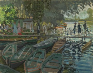
(source: http://www.nationalgallery.org.uk/upload/img/monet-bathers-la-grenouillere-NG6456-fm.jpg)

The above painting, Bathers at La Grenouillère (1869), shows a popular boating and bathing sight on the Seine near Monet’s house in west Paris. The most obvious technique of Monet is his brushstrokes. Just like Manet, he used shorter, more defined and sketch-like brushstrokes. However, Monet’s seem even more defined than Manet’s do. Although Monet uses a wider color palette, we do see the Manet’s influence on the difference between light and shadow in this painting. In the foreground, Monet uses darker colors to paint the boats and show that they are covered and completely in the shade due to the trees that seem to be arching over the boats. As for the background, that is were Monet uses lighter colors to show the source of the sun’s light. The lighter colors in the background show the sun reflecting in the water of the Seine and the bathers in the river. We can also see another light source to the very left of the painting, where there appears to be an opening in the trees and the sun shines through. What is most impressive about Monet’s techniques in this painting is the way he shows the ripples in the water. Switching between light blues and other colors (such as the dark to reflect the women in black, or the green to reflect the tree’s leaves), we get the sense of waves and ripples in the Seine, perhaps from the movement of the bathers swimming around in the water. Overall, Monet’s brushstrokes add a texture and detail to all the subjects within the painting. Every tree, person, boat, etc. can be made out thanks to Monet’s way of painting.

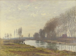
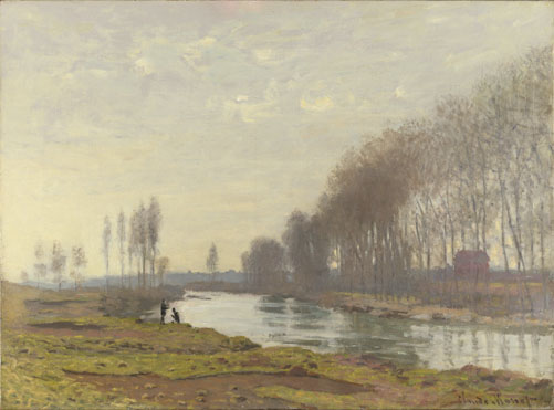
Another work that shows Monet’s famous Impressionist style is his painting The Petit Bras of the Seine at Argenteuil (1872), pictured below.

monet-petit-bras-seine-argenteuil-NG6395-fm

(source: http://www.nationalgallery.org.uk/upload/img/monet-petit-bras-seine-argenteuil-NG6395-fm.jpg)

As previously mentioned, Monet focused his paintings on depicting a single subject in differently lighting conditions. This painting again shows the River Seine that Monet painted so often. However, as influenced by Manet, Monet plays with light differently in this painting than he did in the previous. In this specific painting, there seems to be little shadow featured, however it appears that the scene as a whole takes place outside while it is overcast and cloudy. Monet’s color palette contains mostly earth tones that are fairly the same. The lighter colors are again featured in the Seine where Monet shows his talent by painting the movement in the water and the shadows of the trees along the river. Although there are not as many short, sketch-like brushstrokes in this painting than the previous, we can still see some of those Impressionist-like brushstrokes in the grass in the foreground and the River Seine.

After looking at many paintings from the Impressionism movement, we moved onto Post-Impressionism. One of the leading Post-Impressionist painters was George Seurat. His specific style was different than that of the Impressionists. Seurat strayed away from the apparent spontaneity and rapidity of Impressionism and developed a structured, more monumental art to depict modern life. At the beginning of his painting career, he followed a more traditional path, being taught to paint at the École des Beaux-Arts in Paris, studying the works of early Italian and 17th-century French artists in the Louvre, and exhibiting his works at the official Salon. Seurat not only combined his traditional approach to art with the study of modern techniques, but he also applied ideas from contemporary optical theories of color relationships. His disciplined work, although it contrasts with many of his Impressionist contemporaries, was extremely influential. Below are two of Seurat’s paintings.

seurat-river-bank-seine-asnieres-NG6559-fm

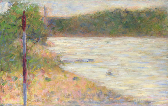
(source: http://www.nationalgallery.org.uk/upload/img/seurat-river-bank-seine-asnieres-NG6559-fm.jpg)

The above painting by Seurat is A River Bank (The Seine at Asniéres) (1883). Because Seurat followed traditional teachings of art, the subject matter is not as radical in this painting as the subject matter had been in previous artists. There is no depiction of modern life, which is odd in Seurat’s case as he as inspired by modern life. However, it make sense, being taught the traditional rules of art, that he would depicting a landscape rather than modern Parisian life. Because he did have a more structured approach to his art, there are aspects of the painting that are very organized. For example, the composition of the painting is very geometric due to the guiding lines. There is a vertical pole to the left, which is again mimicked in the background of the painting more towards the center. There are horizontal lines with the back shoreline of the river, which are again repeated with the horizontal line of the horizon in the background. Additionally, the diagonal line of the riverbank in the foreground seems to lead out of the bottom right corner of the painting, rather than a random spot along the border of the painting. This painting is a great example of Seurat’s deliberately structured approach to his works.

The second painting by Seurat, Bathers at Asnières (1884), is pictured below.

seurat-bathers-asnieres-NG3908-fm

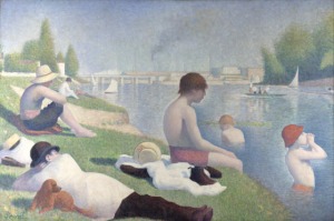
(source: http://www.nationalgallery.org.uk/upload/img/seurat-bathers-asnieres-NG3908-fm.jpg)

This painting by Seurat is one of his most famous. It is the style of this painting and the techniques used that truly embody Seurat’s way of painting. In this specific work, we see that modern life was the subject matter, as many of Seurat’s paintings were. Although his style of painting did not mimic that of the Impressionists, Seurat still was influence to depict modern life and contemporary Paris. Composition-wise, the figures are clean cut and spread throughout the canvas. We see horizontal, vertical, and diagonal lines throughout the canvas, as well. The horizontal lines appear in the background with the bridge. The diagonal lines are seen with the direction of the river, the slant of the hill, and even the direction of the man’s body laying in the foreground with the small dog. As for vertical lines, the figures standing, sitting straight up and the trees in the background on either side of the canvas allow the eyes to see the vertical movement throughout the painting. Together, all three directions create movement and allow the eye visual relief since there are no overpowering lines of one specific direction. As for colors, Seurat sticks to a lighter palette for the most part. However, the dark reds and oranges seen in the man’s pants, the shoes of the person sitting on the edge of the bank side and the figures’ hair are bold statements against the light greens and blues. As we can see, Seurat uses light colors very faintly around the figures in the water, almost giving them a halo effect, to stand out against the blue. He also adds some dark blue around the figure in the center, for example, to further emphasize the figure’s outline. One of the most important things to mention about Seurat is his invention of pointillism. It was a technique he used in which he would create countless tiny dots of pure color placed in extremely close proximity to each other. When viewing these dots at a distance, the human eye is meant to fuse the individual dots together so that they turn into areas of solid color to the viewer. Even though Seurat initially did not use pointillism in this painting, he returned to it after it was finished and added dots of contracting colors to created vibrancy and luminosity. One of the areas he added these dots are in the boys hat, where there are now orange and blue dots.

One of the last artists we looked at was Cézanne. Although he was associated with the Impressionists, he had another agenda art-wise. He claimed that his ambition was to “make of Impressionism something solid and durable like the art of museums.” His work, discovered by the Paris avant-garde during the 1890’s, had significant influence on Picasso and the development of 20th century art. Born in Provence, Cézanne frequently visited his birthplace throughout his life, as he was obsessed with its dramatic landscapes. He had many, many influences, including Courbet and Manet earlier in his career. His earlier works often mimicked Courbet, as Cézanne would apply thick layers of paint with a palette knife. In the 1880’s, his brushwork became more and more systematic and ordered. Starting to place more emphasis on structure and solidity by using color instead of light to convey forms, Cézanne worked slowly and methodically. He carefully selected subjects he could study for long periods of times. Later in his career, his innovative compositions won over the respect of younger artists like Picasso, and fundamentally affected the course of 20th-century art moving forward. Two of his paintings are shown below.

cezanne-landscape-poplars-NG6457-fm

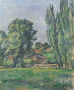
(source: http://www.nationalgallery.org.uk/upload/img/cezanne-landscape-poplars-NG6457-fm.jpg)

As one of his earlier paintings, Cézanne’s Landscape with Poplars (1885-7), shows many of the techniques that were specific to his painting style. Knowing that Cézanne was obsessed with Provence, it is safe to assume that the landscape depicted is of his birthplace in France. As his brushwork became increasingly systematic and ordered in the 1880’s, we can tell that this painting was from that time period without having to look at the year it was created. We can especially see the methodical brushstrokes in the grass painted in the foreground. Even the trees and house they surround are painted with careful brushstrokes, as they are all defined and separate, not sketch-like or blending into each other as they might have for another Impressionist painter. When looking at the painting, we can see different shades of green within the grass, and we are able to tell where the sun hypothetically should be hitting the grass and the house and the tress. To convey the light source and the shapes of objects, we see Cézanne’s method of using different colors rather than playing with light or white paint. Cézanne uses colors to show different patches of grass, the outline of the house, the perspective of the trees, etc. In his next painting, Bathers (Les Grandes Baigneuses) (1894-1905), we see many of the same techniques.

cezanne-bathers-les-grandes-baigneuses-NG6359-fm

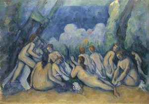
(source: http://www.nationalgallery.org.uk/upload/img/cezanne-bathers-les-grandes-baigneuses-NG6359-fm.jpg)

Although this painting of Cézanne’s was later in his career, we still see many of the techniques that are specific to his work. First off, Cézanne again plays with color to show forms rather than playing with light. He has outlined all the figures with shades of blue to not only separate them, but show their shadows, as well. The coloring of his figures also varies, with lighter bodies in the back and more yellow bodies in the front. This could be to show where the light source was coming from in the painting. Overall, his variation of color throughout the canvas allow him to define the different objects and the depth of the painting instead of using white paint or light to do so. Cézanne’s brushstrokes are not identical to the ones of the previous painting, however they still appear to be orderly and structured. In the above painting, the brushstrokes seemed to be continuous short lines, whether they were going horizontally, vertically or diagonally. Here, in this painting, the brushstrokes seem to be more blended and free, and less “line” like. This creates a bit more movement throughout the painting and softens it up, too. While the subject matter is not Provence, we still see an element of nature to the painting, mainly indicted by the colors and the background of the canvas. Cézanne’s ealier work, like the previous painting, had simple compositions. However, in his later works like the painting above, he developed more complicated compositions. We can see in Bathers (Les Grandes Baigneuses) that Cézanne has mainly diagonally lines as opposed to horizontal or straight lines. The diagonal lines go in all directions, however they all seem to lead towards the middle of the canvas as if it is the main focus. This is an example of how innovated Cézanne was with his compositions. Comparing his two paintings above, we can see the development of the artist’s abilities throughout his career.

While we saw many artists at the National Gallery, the ones above were worth mentioning. Their talent not only influenced artists in the following years, but it is the reason that these paintings are still so famous today. The Impressionists and Post-Impressionists radically changed the art world and produced works that captured expertise and skill.

The Pre-Raphaelites

Our second class visit was to the Tate Britain to see the work of the Pre-Raphaelites. The Pre-Raphaelites have one of the most interesting histories behind their artwork, giving their paintings a unique and recognizable style. Throughout our visit, we were able to match key facts of the Pre-Raphaelite history with techniques in the artwork.

The Pre-Raphaelites, commonly known as the Pre-Raphaelite Brotherhood, was a secret society of young artists that attended the Royal Academy School. Its predominant leaders were artists William Holman Hunt, John Everett Millais and Dante Gabriel Rossetti. The Pre-Raphaelite Brotherhood, initialed as P.R.B., wanted to overturn everything they were being taught at the Royal Academy and return to styles of early Renaissance and medieval painters. The Academy had held Renaissance artist Raphael as the pinnacle of artistic success, which the Brotherhood saw as formulaic and backward looking. The Pre-Raphaelites were inspired by the extreme details and flat compositions of the early 15th century paintings, and, most importantly, the rejection of any hierarchy of symbols in paintings, giving equal importance to all subjects and figures. The early Renaissance artists also painted on white grounds, which made their colors stand out brightly. This early Renaissance style, from which the name “Pre-Raphaelite” derived, embodied simplicity and truth in art, which the P.R.B. wanted to recapture. The artists of the Pre-Raphaelite Brotherhood took a lot of heat because of their defiance against the Royal Academy rules. They were accused of using photography, a new technology at the time, to paint from. And, although they did not paint from photography, there is a sharpness to their paintings that resembles a high definition focus to photographs.

The paintings of the Pre-Raphaelites took form to show all subjects through maximum realism. No matter what the P.R.B. painted, whether it was religious, literary, poetic or alluded to modern social problems, there was always extreme detail that encouraged prolonged looking. The new process of prolonged looking gave the Pre-Raphaelites’ paintings a modern style at the time, becoming highly influential for years of artists to come. Below are some of the paintings featured at the Tate Britain, along with an analysis for each one.

IMG_2828IMG_2828

Different than many of the portraits of women he painted, John Everett Millais’s Christ in the House of His Parents, also known as The Carpenter’s Shop (1849-50), features six figures spread throughout the canvas. Keeping in mind the rules of the Royal Academy and the fact that the P.R.B. rejected these rules, there are aspects of this painting where one can immediately notice the defiance. First and foremost, the composition is different than the traditional paintings that were being produced at the Royal Academy. The standard composition took the form of a triangle within the canvas, with the two sides of the triangle started at the bottom left and right corners, and diagonally went towards the top of the canvas where they would meet in the middle. It was only within the triangle that the main subjects would be painted. As we can see in Christ in the House of His Parents (The Carpenter’s Shop), Millais did not follow the standard composition, and instead drew all his subjects throughout the painting, widening the focus to the whole canvas, rather than a specific area. Additionally, the colors of the painting are much more vibrant and brighter than the paintings of British art from the 1750s – 1850s. While the brown wood takes up most of the painting, Millais adds spots of color that bring visual relief to the brown. The woman kneeling in the front is wearing a deep blue dress which contrasts the bold white of her veil. Behind her, the older woman wears contrasting green and orange, also bold colors. The top lefthand side of the canvas offers a scene outdoors where we see light greens and blues, and the top righthand side shows a white corner with deep green through the window. Along with the use of bright and vibrant colors, the Pre-Raphaelies were known for their realistic representations of nature, literature, poetry, and even religion. Aside from the title of it, we can tell by looking at the painting that it is portraying Jesus Christ and his family. The red headed child in the middle holds up his hand, which has a bleeding puncture in his palm, and his feet are uncovered where we find another bleeding puncture. He is also dressed in all white, thus indicating that the child is Jesus at a young age. The woman kneeling next to him wears blue and white, a common aspect when representing Jesus’s mother the Virgin Mary. The man to the right, dressed as a carpenter, bends over to put his arm on Jesus’s shoulder, suggesting that it is probably Joseph, Jesus’s earthly father. The boy to the right of the painting, looking shameful, holds a bowl of water, also suggesting the biblical figure of John the Baptist. The other two figures seem to be a young man and an elderly woman, maybe even a grandmother. Overall, all of the figures in the painting are depicted with extreme detail. We can see the veins in Joseph’s arm, the strands of fur on John the Baptist’s skirt, the swelling of the elderly woman’s hands, and almost every piece of hair on Jesus’s head. While the detailing of the figures might make them look astonishing, the painting was rejected because of how it portrayed Christianity in an unappealing way. In the painting, the members of Jesus’s family look grotesque and, in the case of the Virgin Mary, ugly. They do not look angelic or have soft features as they usually do when they are painted. The veins in Joseph’s hand and the cuts on his knees are quite disturbing, and the swollen hands of the grandmother are quite unsettling, too. This most definitely is not a normal representation of Jesus Christ and other biblical figures, truly showing the Pre-Raphaelites’ desire to go against traditional, Academy rules.

The next painting, also by Millais, is not only one of his most famous paintings, but one of the most famous paintings of all time. Ophelia (1851-2), is pictured below.

IMG_2830IMG_2836IMG_2832

As Millais painted many, many portraits of women, this is more typical of his style than Christ in the House of His Parents (The Carpenter’s Shop) is. Ophelia embodies many of the Pre-Raphaelites’ formal techniques: vibrant colors, non-triangular composition, and minute details. Millais manages to incorporate almost every shade of green imaginable throughout the painting, along with vibrant colors in other objects. For example, the close up picture of Ophelia shows the bold colors of the flowers surrounding her in the water. Because of Millais’s minute details, we can tell what type of flowers they are, too. From the close-up picture of Ophelia, we are able to see the shading in her chin that Millais added with a soft grey color. The painting not only shows Ophelia, but an overwhelming nature scene. This is different than many of the paintings that were being produced at the time. As previously stated, the Pre-Raphaelites were interested in painting about social movements and problems, rather than traditional, Raphael-like paintings. Around the time Ophelia was painted, Darwin’s Theory of Evolution was developing and becoming increasingly known. The nature scene deputed in Ophelia alludes to the social happenings of that time, specifically Darwin’s Theory. Additionally, in the third picture, we can make out a skull within the leaves. From the full, larger view of the painting, it is hard to notice the skull. However, like a typical Pre-Raphaelite painting, prolonged looking is necessary to see all the details in the work.

While we looked at many beautiful paintings, the last one worth noting is The Awakening Conscience (1853) by William Holman Hunt. The painting is pictured below.

IMG_2844IMG_2847IMG_2845

The Awakening Conscience was one of the more criticized paintings of the Pre-Raphaelites, not only for its formal aspects, but for its suggestions about society at the time. For a formal analysis, we see again the common techniques of P.R.B. paintings. There are a vast amount of bold, bring colors throughout the painting and the detail within the painting is astonishing. From the lace of the woman’s dress, to the pattern in the blanket, to the reflection of the garden outside, Hunt manages to add in every detail he possibly could. So much detail, in fact, that it looks like a photograph in some ways. For example, the second picture shows Hunt’s ability to play with color to create light. By focusing in on this corner of the canvas, it looks more like a photograph than a painting. This is a prime example of why critics of the Pre-Raphaelites thought they used photography to draw from; their detailing and manipulation of color was so intense that it looked real. As for perspective, Hunt gives more depth to the painting by adding in the reflection of the garden outside a window in the back. Without that window and the reflection, the painting would seem much more shallow. While the formal aspects of the painting are fascinating, the underlying message of The Awakening Conscience is a societal commentary. As pictured, there is a woman sitting on a man’s lap. However, they do not seem like they are husband and wife. Rather, it is a middle-class man and his mistress that are painted. From the space of the room, we can tell that it is not the house of an upper-class person. Additionally, we can tell from the various items lying around the room and its “messiness” that the relationship is a bit more whimsical, again implying that the woman is a mistress. Her gaze into the distance fits the title, as she does seem to be “awakened,” perhaps by something that the man is saying or doing. While she may be his first choice at the time, she is a mistress, after all. Mistresses are known to be discarded after a period of time, and there are a few details within the picture which imply her eventual “discard.” First, there is a single glove lying on the floor by the mistresses’s feet (more visible in the second picture). The glove, which seems to have been thrown without a care, can imply that the mistress will eventually be tossed, too. Additionally, the cat and bird below the table on the left of the painting (more visible in the third picture) show the cat trying to reach and hold down the bird. The cat grabbing the bird can signify what is going on between the man and woman above them; the man, with more power than the mistress, can determine when she will be discarded. Until then, she is his, and he calls the shots. With all that this painting implies, it was really a commentary on society at the time when it was painted. Again, something the Pre-Raphaelites were known for doing.

I’ve always known that knowing the history behind an artist and the time of the painting helped understand it. However, nothing drove home that fact better than visiting the Tate Britain and seeing the Pre-Raphaelite paintings. The Pre-Raphaelites have, by far, one of the most interesting histories behind their artwork. Not only are their formal techniques so radical, but the context and reasoning behind their paintings are, too.

British Art (1750 – 1850)

For our first class trip on Friday, we visited the National Gallery to see British art from 1750 -1850. Our analyses covered many artists, including Reynolds, Gainsborough, Van Dyck, Turner, Claude and Constable. Being that it was my very first time analyzing the composition of paintings, the task seemed difficult at first but got easier with each painting we got through. The first painting we looked at, ‘Lady Cockburn and her Three Eldest Sons’ by Joshua Reynolds, is shown below.

IMG_2695

In this portrait, Lady Cockburn is painted as a poised, calm and loving mother. The rich red of the curtains and deep orange of Lady Cockburn’s clothes emphasize her and her children, painted with lighter shades of pink and beige. Because the red and orange surrounding Lady Cockburn and her children balance out, another deep color was needed to balance out the lightness of the column to the right of the painting. This is the purpose of the parrot, who adds the red to complete the balance around the subject. Additionally, the parrot is located in the golden section of the painting, as Lady Cockburn and her children take up most of the space in the rest of the painting. Lady Cockburn and her children form a triangular shape themselves, which is echoed in the background with the opening of the curtain where we see a landscape scene. The subjects are in the foreground of the portrait, conveying to viewers that they are the main focus of the painting. Reynolds’s use of dark colors to create curves and folds repeats throughout the painting from Lady Cockburn’s clothes all the way up to the curtains. For example, the curves in Lady Cockburn’s dress match the curves of her child laying on her lap, the arm of the child to the left, and the drape in the curtain above. The curves go from bottom left to right, the same way that the diagonal lines in the painting go. The painting can be split into there sections from two diagonal lines, all starting from the left and going upwards as the lines continue to the right. This splits up the picture to go from a dark section at the top left (with the curtains), to a light section in the middle (with Lady Cockburn and her sons), back to a dark section in the bottom right (with Lady Cockburn’s clothing).

After analyzing the composition of Lady Cockburn, we contrasted it to Van Dyck’s ‘Charity,’ featured below.

IMG_2698IMG_2699

Van Dyck painted ‘Charity’ before Reynolds had painted ‘Lady Cockburn and her Three Eldest Sons.’ ‘Charity’ was painted as biblical reference to the three Christian virtues and represents the quintessential loving mother. Because Reynolds’s painting was a portrait of Lady Cockburn, it alluded to ‘Charity,’ portraying Lady Cockburn in the best light as a mother, thus flattering Reynolds’s client and showing Lady Cockburn her importance. Differing from ‘Lady Cockburn,’ ‘Charity’ has more vertical lines through the painting rather than curves. We can see the pattern of vertical lines through (from left to right of the painting) the child on the left’s body, the curtain in the background, Charity’s gaze up to God, and the child on the right’s body, from his left to his arm as he reaches up towards his mother. The blue cape around Charity’s body is complementary of the orange/red blanket at the bottom of the painting, and the blueness of the cape also brings out the blues of the sky in the background.

As we finished up contrasting ‘Lady Cockburn’ and ‘Charity,’ we returned to Reynolds and analyzed the composition of this painting, ‘Lord Heathfield of Gibraltar.’ The painting is pictured below, although the quality is not the best because of its high placement on the wall!

IMG_2700

Similar to ‘Lady Cockburn,’ Reynolds uses dark shades of brown and orange around the picture to bring out his main subject, Lord Heathfield, in the middle. The brightness of Lord Heathfield’s red coat stands out against the darkness of the canons going off in the background. The story behind the painting is that Lord Heathfield, Governor of Gibraltar, is holding the key to the British fortress during the Spanish attack. When looking at the painting, the eyes are immediately drawn to the key that Lord Heathfield is holding. In photography, there is a term called the rule of thirds. It states that if the picture were broken into thirds, both horizontally and vertically, the eyes are drawn to the intersecting points of the horizontal and vertical lines dividing the picture. We can see that the key is at the spot where a vertical and horizontal line would intersect.

After analyzing Reynolds’s portraits of Lady Cockburn and Lord Heathfield, we moved onto his rival, Thomas Gainsborough. We looked at two of Gainsborough’s portraits; ‘Mr and Mrs William Hallett’ and ‘Dr Ralph Schomberg.’ These portraits, very different from Reynolds’s, are pictured below.

IMG_2703

The couple of ‘Mr and Mrs William Hallett’ are portrayed as a very well to do, fashionable couple. We can see that to left of Mrs Hallett, where the dog is located gazing up at her, there is a golden section. In that golden section of the painting, the colors are lighter and Gainsborough’s brushstrokes are lighter, as well. These details are most noticeable in the dog’s fur, the left background of the trees and Mrs Hallett’s dress. Mrs Hallett’s dress itself is very detailed and contains many different colors which help blend it into the subjects and landscape surrounding her. For example, the front of the dress contains strokes of orange seen in the foreground, while around her waist and arm Gainsborough added blue to bring out the blue of the small trees and color of the sky in the background. As for Mr Hallett, his clothes give an overall darker tone as they are black. However, Gainsborough continues to work colors of the landscape into the clothing. We can see that, under Mr Hallett’s coat, there are hints of green and orange that are also surrounding him in the landscape. As for the lines of the painting, it is mainly vertical. Not only are Mr and Mrs Hallett vertical, but the portrait itself is. To create movement, Gainsborough has added small curves and diagonal lines throughout the portrait. The tilt of Mrs Hallet’s hat, the dog gazing up diagonally towards his owners and the curve of the trees in the background all relieve the strong vertical lines of the painting.

IMG_2705

In this portrait, ‘Dr. Ralph Schomberg,’ we see many of the same techniques that Gainsborough used in his portrait ‘Mr and Mrs Hallett.’ Dr. Schomberg himself is painted with very clean cut lines, while the landscape around him is painted with light and loose brushstrokes. By doing so, not only is there movement within the portrait, but there is a shallow depth of field between the audience and the subject. Almost as if this were a photographed portrait, Dr. Schomberg is in focus, while the background seems to be blurred. His head specifically seems to be the most clean cut. The clouds behind him are very dull and there is not much texture or detail to them; it just seems as if it is a sheet of gray. This emphasizes the clean cut lines and details in Dr. Schomberg’s face and hair. As for colors, we again see that the landscape in the background is lighter and as we come to the foreground, the landscape is warmer. Dr. Schomberg’s red coat is complemented by the greens of the foliage that surround him. There are, again, strong vertical lines in the painting, as it is set vertically and Dr. Schomberg and his cane run directly up and down. However, they are relieved by the diagonal lines caused by the landscape and sky in the background. The flow of Dr. Schomberg’s coat curves in the same direction as the tree in the upper right hand corner, creating more movement in the portrait.

Overall, Gainsborough’s portraits seem to be much more honest than the portraits of Reynolds. ‘Lady Cockburn’ and ‘Lord Heathfield’ were both portraits where Reynolds depicted them not as themselves, but in a different light to flatter his clients. As for Gainsborough, he portrayed his clients in more natural, believable settings that seemed to capture his clients as they truly were.

We touched upon a few of Gainsborough’s landscape paintings before moving onto our third artist, J.M.W. Turner. Turner, best known for his paintings of light, had many works we could admire at the National Gallery. We focused our analysis on four of his works; ‘Ulysses deriding Polyphemus – Homer’s Odyssey,’ ‘The Fighting Temeraire,’ ‘Sun Rising through Vapour’ and ‘Dido Building Carthage,.’ All four paintings are pictured below, in order.

IMG_2707

In both ‘Ulysses deriding Polyphemus – Homer’s Odyssey’ (above) and ‘The Fighting Temeraire’ (below), the audience is immediately drawn to the sun in the horizon. Both paintings have extreme detail when it comes to the sun. Not only does Turner add a handful of shades and colors to the light radiating off the sun, but he adds texture, too. If one looks up close to the sun in the painting below, for example, they will see the different textures of the light as it grows away from the center of the sun. Additionally, both suns rest on a body of water, where the blue sits vibrantly under the light. Both paintings include a strong contrast with the boats located in the left of the painting. The dark colors stand out against the recessive light shades of blues, yellows and whites. While the horizon creates strong horizontal lines between the sky and water in both pictures, the rays of the sun create diagonal lines which are mirrored in the boats to relieve the strength that the horizontal lines would create otherwise.

IMG_2709

IMG_2727

In these two paintings by Turner, ‘Sun Rising through Vapor’ (above) and ‘Dido Building Carthage’ (below), we see again Turner’s love for light and the detail he puts into how the light radiates off to the surrounding scene. His use of curves in the shoreline and sails of the above painting offset the horizontal line of the horizon and vertical lines of the ships’s masts. While the suns in these two paintings do not have as much textural detail as the previous two paintings, the vibrant yellow that Turner paints these suns with stand out compared to the rest of the colors and tones in each landscape. In the picture below, we see small, but many, vertical lines, especially in the pillars of all the buildings. However, many things bring movement to the picture, including the curves of the trees, the water, and the mountains in the background.

IMG_2728

Upon looking at Turner’s paintings, one can immediately see his love of sun and light. In all of Turner’s paintings, the sun is the first place the eye is drawn to and the main focus of the painting. It seems that, no matter what else is going on in the painting, no matter how chaotic other elements may be, the sun and light source will always be Turner’s ultimate focus.

The last artist we looked at in the National Gallery was John Constable. Constable was famous for his landscapes, most of which are of the countryside of Suffolk, where he was raised. Two of his paintings, ‘Stratford Mill’ and ‘Salisbury Cathedral and Leadenhall from the River Avon’ are featured below.

IMG_2716

IMG_2719

In both of Constables’s paintings, we see hints of the 19th century French movement of Impressionism. With almost all objects and subjects Constable painted, there are smaller brushstrokes and lines giving more detail and movement throughout the paintings. In Constable’s ‘Stratford Mill,’ we can see that there is much more detail, especially with coloring, in the clouds to make them seem full and fluffy than there are in ‘Sainsbury Castle.’ It almost seems as if the clouds are blobs and smears in ‘Sainsbury Castle’ rather than a realistic representation. One thing quite fascinating about Constable’s paintings, though, is the way he uses color after color to get an extremely detailed and realistic painting of the reflection in the water. In both landscapes, it almost looks as if the water is a photograph, rather than a painting. In both paintings, there is a strong contrast between the sky in the background and the land in the foreground. The bold, dark colors of the landscape truly stand out when the skies are a light blue and gray. Between the details of color and brushstrokes, both of Constable’s landscapes have much movement and, unlike some of the other paintings we’ve analyzed, do not have any strong repeating vertical or horizontal lines. Because of his obvious Impressionist style, it is understandable why his paintings were more accepted in Paris rather than Britain.

As a Business major, I am unfamiliar with the art world and lack the knowledge that any artist or art history major would have at this point in college. However, I approached this course with an open mind and interest to learn about a completely different field of study. After all, being abroad in London (and Europe, for that matter) makes this the perfect time to learn about art in such a culturally rich setting. Our first class visit to the National Gallery proved to be nothing short of interesting and eye opening, and I cannot wait for our class visit to the Tate Britain next week!